Logo Design: When the details matter (and when they don’t.)
My personal Logo opinion: Simple is best. 3 colors and two fonts, tops.
The simple fact is that the more detailed the graphic, and the more colors used, the harder it will be to convert into a single color version,* and the more complicated it becomes for printing.
That said, I always love including a special detail or two in my logos. I think it’s so much fun to figure out how to surprise a client who’s made an odd request or gave me some random info that I decide to work in. You CAN work details into a logo as long as you stay highly aware of what details will be lost at a small size. Going so small that a leaf gets lost may not matter, but losing name legibility absolutely does.
*There are times that you’ll need to provide your logo in one color versions. Many promotional products (pens, etc.), embroidery, door and car decals, etc. ask for one-color files. That does not mean grayscale. That means everything is black or white.
Here are some other things I have to consider when I’m in logo design mode:
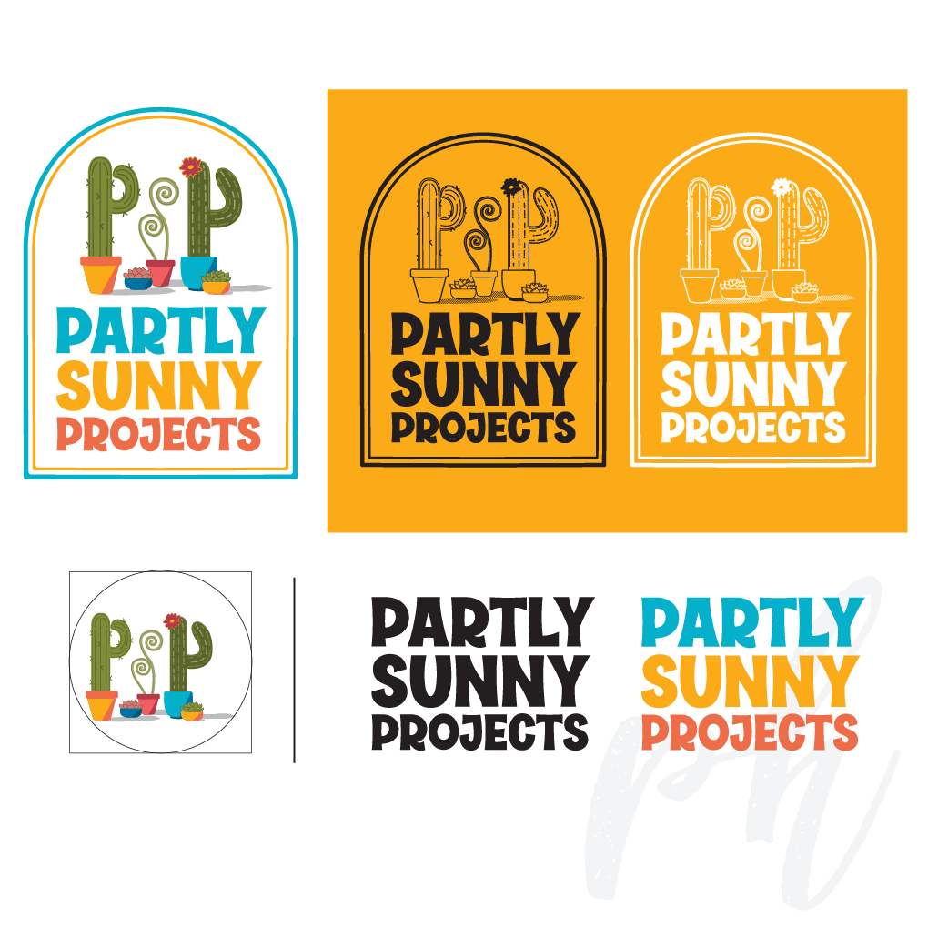
Examples of full color, one color, and separated logo components for use as needed.
Is this a business that needs to use a PMS color model to ensure the colors never vary?
That also requires smaller, costlier printers, so will that be in their budget?
Some printers charge per-color set-up fees. That adds up.
Keep the text thick enough to be legible. Reconsider trendy scripts or other fonts, because not only do they often start looking generic and dated quickly, they’re often borderline illegible.
If the business name requires multiple lines, make sure the primary name remains readable at a small size, even if the supporting text gets partially lost. (Keep any tagline versions for use only when the logo can be big enough to easily read it.)
Can the logo be broken into pieces- ie. text only- easily if necessary for best visibility?
When I create a new logo or branding package for you, you’ll receive a reference sheet at the end of our project that has your logo’s visual basics—your color palette, any font(s) used, and a file folder overview. If you opt for the Branding Basics package, you’ll also get an expanded color palette, including those used in the logo plus more, as well as free-to-download font recommendation options, all for branding purposes.
Using these fonts and colors every time, consistently across platforms and time—even if that’s all the ‘branding’ you can muster right now— will ensure your brand stays consistent.
Learn more about my logo packages here!
Looking for other design stuff? I do that, too.

I’m the one on the right.